Zündel develops and cultivates brands.
competenceportfoliotechnologymediatourismculture about ZuendelHow to turn the Chilean mobile communications market upside down
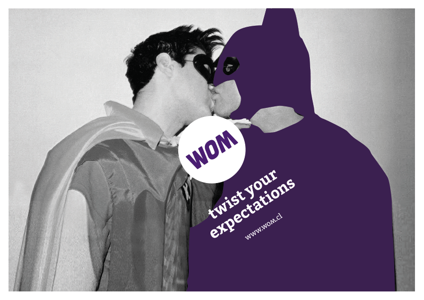
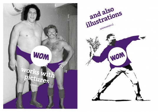
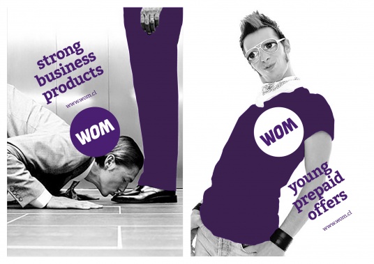
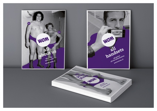
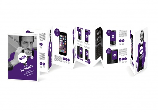
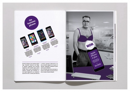
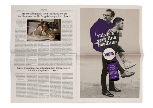
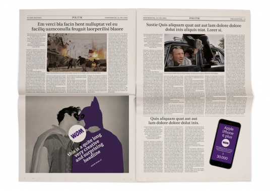
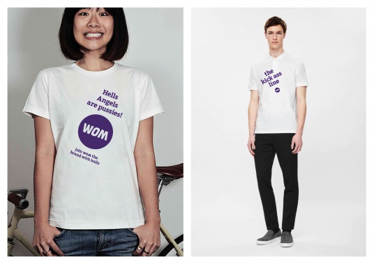
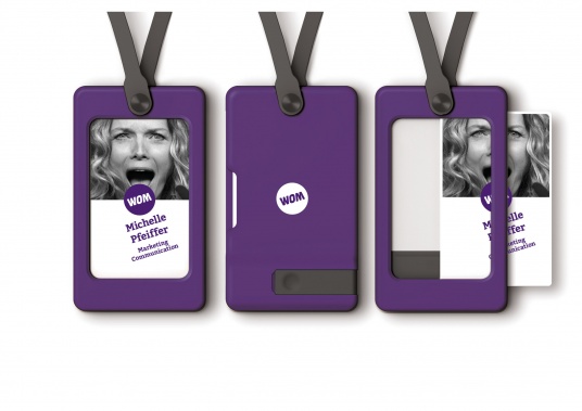
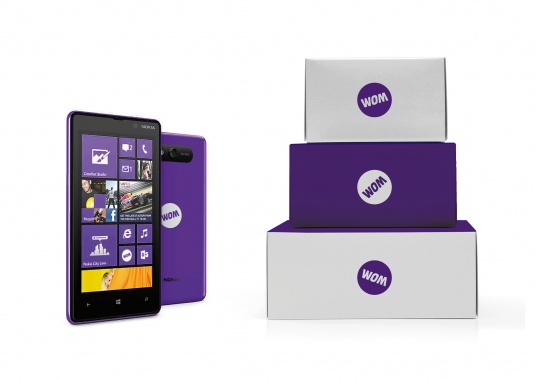
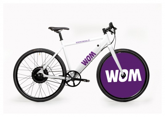
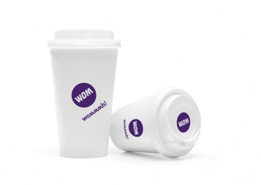
The telecommunications supplier Nextel is renamed: into WOM. And with a 'WOM he also wanted to turn the whole Chilean market. Luckily the name WOM takes every twist and turn unharmed. Moreover, he even gains radiance in this process. We tuned the existing logo to the point and confidently put it in the centre: Now everything is revolving around the dynamic and confident brand. The advertising-agency in charge, Divan, employs a cheeky and provocative tonality - we splash the corporate colour purple onto black and white pictures just as provocatively and intensively. True to the brand promise: 'Twist your expectations!' WOM literally turns upside down in order to surprise the customer - and the brand simply joins in.
We were allowed to transform the existing logo into a (literally ordered by WOM) kick-ass-brand. Awesome!
www.wom.cl
See also: talking design