Zündel develops and cultivates brands.
competenceportfoliotechnologymediatourismculture about ZuendelBy now Telecommunications are definitely considered as part of our basic supply. Therefore it is
only logical that the Elektrizitäts- und Wasserwerke in the city of Buchs also offer this service to
all households in the Swiss Rhine Basin (the Rhine is called Rii in Swiss German).
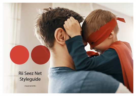
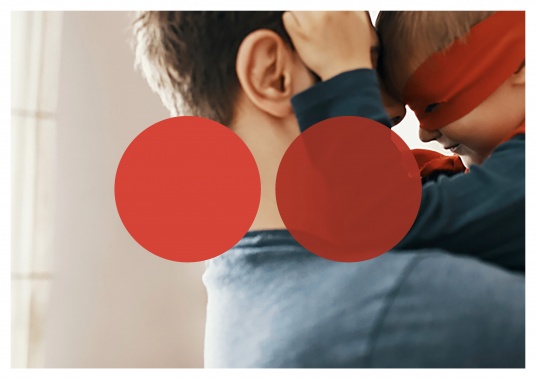
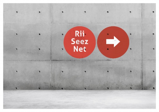
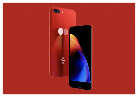
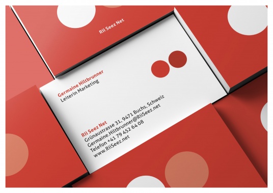
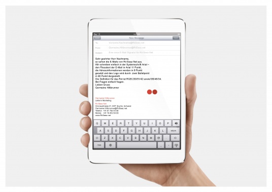
Rii Seez Net fulfils the wonderful mission of bringing people closer together viatelecommunications. Municipal companies are ideal partners for this service, because they workclose to their customers to begin with. This regional and emotional proximity is a strong unique selling proposition in telecommunications and a highly relevant competitive advantage. That's why we chose proximity as core brand value, emphasized it by the redesign and made it clearly perceptible as a communications link. The 'dots', known and liked for a long time, move closer together optically. On the one hand, they represent the two i-points of the Rii and, thanks to the varying design, also communication and familiar closeness between two individuals.
For Rii Seez Net we were allowed to pin the brand values, the entire corporate design - including
the logo and the communication link - to the point, or more precisely, to the two Rii points.
www.riiseeznet.ch