Zündel develops and cultivates brands.
competenceportfoliotechnologymediatourismculture about ZuendelIt's really fascinating when the market demands a new positioning which in turn leads simply and logically to a new strategy and design.
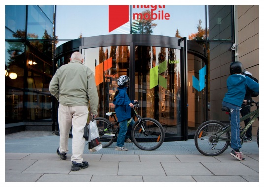
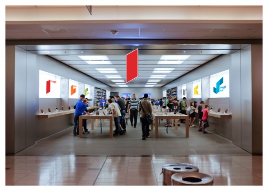
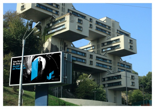
Magticom is Georgia's market leader - for network quality, customer base and product range. Magticom is the only communications company in Georgia which not only offers landlines and mobile telephony, but also internet and television. Magticom is therefore the clear number one and provides everything from a single source.
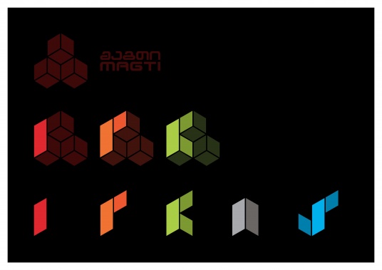
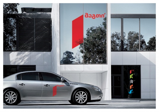
We had to breathe new life into the existing brand while maintaining the stance of a market leader and technology powerhouse - this meant consistently adapting the product brands without damaging the existing substance of the design. The existing brand presence was, however, astonishingly inhomogeneous. The honeycomb symbol was the only strong association with Magticom and so we used it as the visual cornerstone for a system logo.
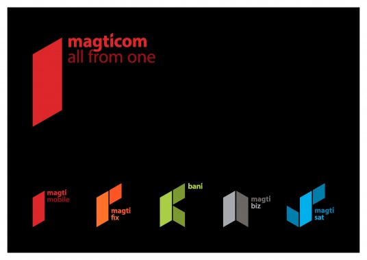
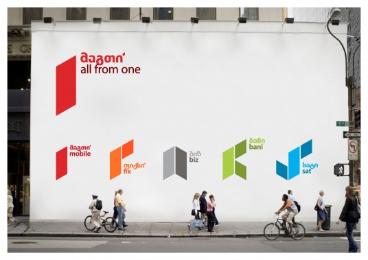
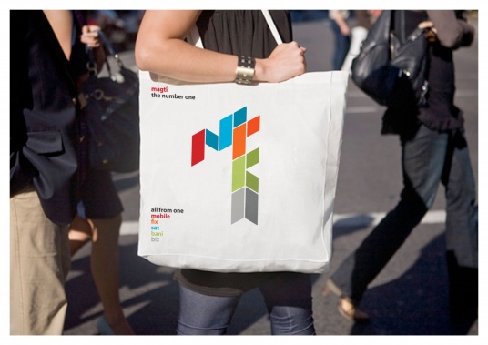
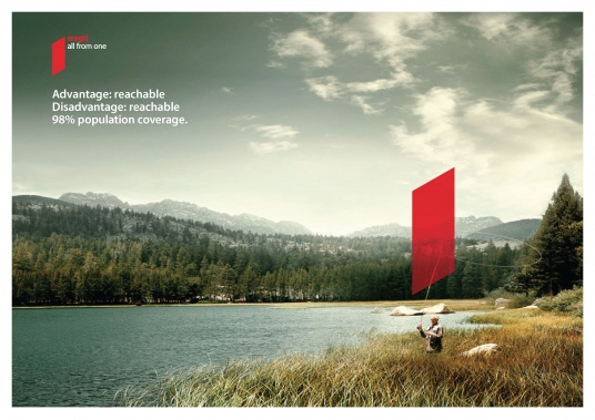
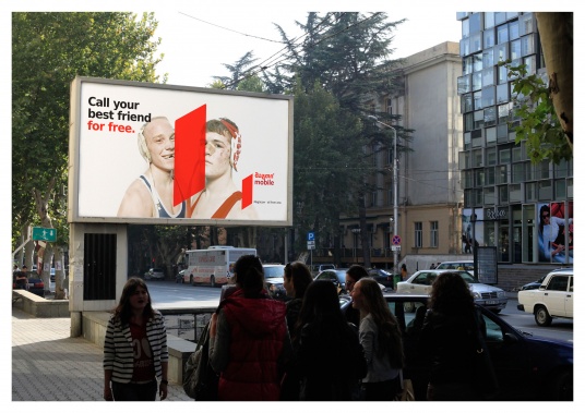
A stylized '1' stands for 'number one' and 'all-in-one service', while the honeycomb system allows a sharp change to the product brands, whereby the umbrella brand never fades from its leading role.
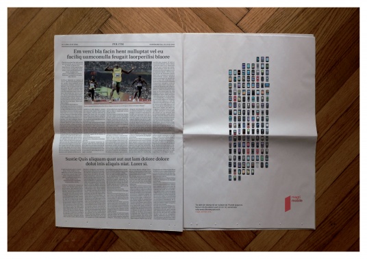
The new brand communicates the success story of Magticom from the very first glance, demonstrates the flexibility of the product range and the resulting consumer benefits of simplicity.
Zündel Branding developed the brand including positioning, corporate design and logo - however a change of ownership has put the project and payment ethics on Georgian ice.
The epic Georgian images are by Sergo Edisherashvili.