Zündel develops and cultivates brands.
competenceportfoliotechnologymediatourismculture about ZuendelWe believe that corporate design can - and must - explain the story behind the brand. The more clearly the mission and vision is defined in advance, the more straightforward it is to represent the essence of the brand and translate this into visuals.
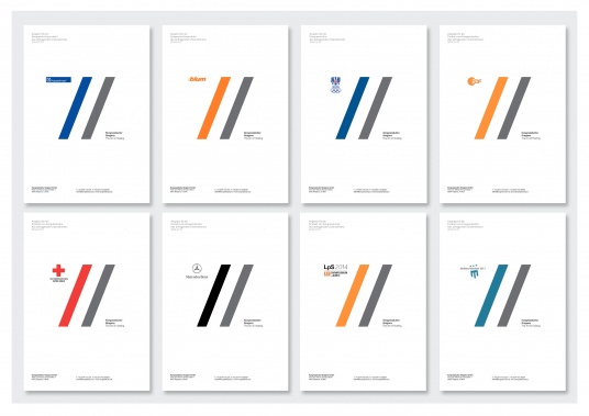 Congress Culture Bregenz:
Bregenz Congress Culture stages events - with expertise and creativity - and above all with great empathy for what customers need. The design sums this up precisely - two slashes represent the way Congress Culture supports and advises its clients - the logo even encompasses the corporate colours of each customer and demonstrates how seriously their needs are incorporated.
(for more see IKB case study)
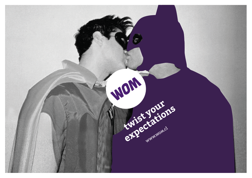 WOM:
WOM:If you want to turn the Chilean mobile communications market upside down, a name still readable after this move is a real capital. We tuned the existing logo to the point and confidently put it in the centre: Now everything else is revolving around the brand and the brand promise 'Twist your expectations!'.
(for more see WOM case study)
_resized.jpg) Frischhut:
Frischhut:It was only when we recognized Frischhut as an ingredient brand, that we knew what tools the brand needs for communication: A mechanism that brings hidden things into the spotlight. A clear sign that not only makes quality visible but also highlights it. And this learned symbol -the '*' - helps communication and carries the entire corporate design right up to a new logo.
( * for more see Frischhut case study)
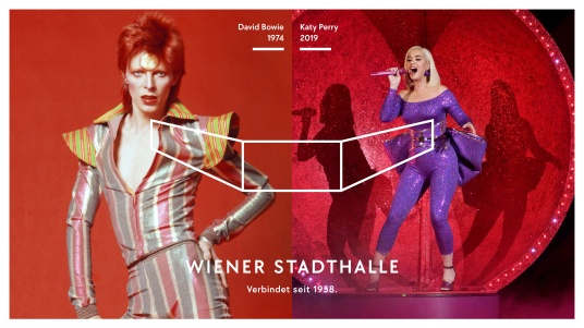 Wiener Stadthalle:
Joy connects – this could be defined as the smallest common denominator for design and communication. Whether it's soft pop or hard rock, from ATP tournaments to magic shows: all 16,183 spectators are brought together by a common idea: enthusiasm. That connects. And the corporate design repeatedly and unequivocally demonstrates this.
(for more see Wiener Stadthalle case study)
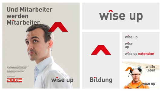 wîse up:
wîse up is an educational platform that transforms knowledge into progress and advancement. The circumflex shows this at first glance and can turn companies into better companîes – or even make mîssions visually more successful. The circumflex is a visually strong symbol, incredibly easy to use – from the key visual to the ambitious headlîne.
(for more see wîse up case study)
_resized.jpg) Radio Volare:
Radio Volare:We did not merely want to stage the infamous Dolce Vita and to take the target group to beloved Italy. We hat a little time travel to Mastroiani, Laureen and Celentano in mind, the Vespa Primavera included. Naturalmente in mint.
(for more see our Volare case study)
 VERBUND:
A simple symbol for complex times.
Without exaggeration, Verbund is Austria’s most vital ally in combating climate change and the energy crisis. This requires a strong symbol—not just one to set the tone, but one that can unite people under a shared mission. The “Mission V” doesn’t just make an external impact; it also fosters unity internally. The V translates responsibility, pioneering spirit, and transformation (in German: Verantwortung, Vorreiterrolle und Veränderung) into a cohesive visual identity for every brand touchpoint.
(for more see our Verbund case study)
The Volksoper Vienna is the most versatile music theatre of Austria. To put this coloured variety 'on stage', we turned the four genres - opera, operetta, musical and ballet into the major columns of the corporate design.
(for more see Volksoper Vienna case study)
_resized.jpg) Beyond Carbon Energy:
Beyond Carbon Energy:Beyond is set to revolutionize the energy systems of buildings. Shaking up learned perspectives, driving future-proof solutions, and transforming old thinking for good.
(for more see Beyond Carbon Energy case study)
_resized.jpg) iKB:
iKB:The Innsbruck municipal enterprises (Kommunalbetriebe) provide energy, water, district heating and waste treatment, along with almost the entire infrastructure - all from a single source.
The IKB therefore makes life in Tyrol easier, which has turned it into the clear No.1 in Innsbruck - the small trick of fusing i and 1 conveys this via the logo and makes the communication just as unique as the product.
(for more see IKB case study)
_resized.jpg) indoors:
indoors:We do not want to miss GPS navigation outdoors anymore. indoo.rs finally offers orientation and information within buildings. And this is not only practical to use, but also very simple to depict.
(for more see indoors case study)
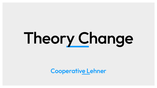 Cooperative Lehner:
A single line turns two terms into one.
It connects what belongs together — visually and conceptually.
By underlining the transition, a new whole emerges.
Research, business and society become a focused cooperation.
And the way of working becomes the design principle.
(for more see this very cooperative case study)
_resized.jpg) Lounge FM:
Lounge FM:Lounge FM quite simply stands for relaxation and we were able to translate this aura of the brand 1:1 in the design and communication approach. Lounge FM spreads peace and relaxation in a hectic advertising environment and even the branding can be much more relaxed thanks to a gentle, calming wave.
(for more see Lounge FM case study)
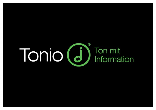 Tonio:
Tonio enables radio broadcasters to send information via tones (sounds). We did exactly the same thing visually and brought together the common symbols for sound and information. This explains the product at a single glance.
(for more see Tonio case study)
_resized.jpg) Cell C:
Cell C:We repositioned this South African telecoms company by opting for an honest brand with a lot of local colour and even more national pride. The design plays the role of a copyright sign and shows how Cell C celebrates the country and the people as one - also embracing responsibility.
(for more see Cell C case study)
_resized.jpg) Pro Corpore:
Pro Corpore:Pro Corpore brings together three institutes under a single roof. We chose a visual representation for the variety of this state-of-the-art beauty, workout and therapy centre based on the ingenious circuit training whose success lies in repeating each circuit station three times.
(for more see Pro Corpore case study)
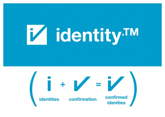 identity Trust Management:
identity.TM verifies identities - in a safer, faster and easier way than competitors do. And the logo reflects this brand-story one-to-one: it is also safely, quickly and easily 'dentified'.
(for more see our identity case study)
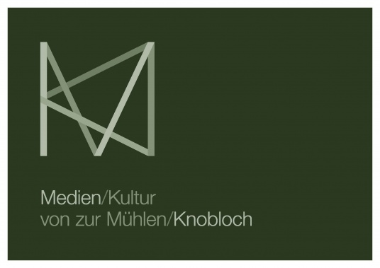 Medien/Kultur:
Media and Culture do not have much in common at first sight. Yet they belong together and complement each other. Since the initials of both advisers for media- and cultural-enterprises, von zur Mühlen and Knobloch, underline the cooperation of M and K once more, we integrate and combine the target-groups, branches and major players in a clear visual.
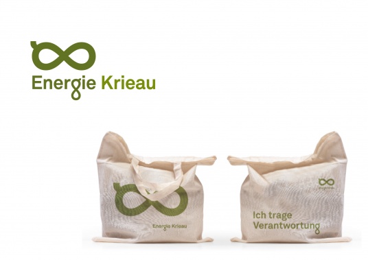 Energy Krieau:
For infinitely renewable energy there is a very logical visual representation. 'Naturally' such a product is of green colour and the brand itself deals with the given resources creatively and flexibly, too.
(for more see Energy Krieau case study)
The Viennese Location Development promotes sustainable city development projects - and thus it provides for healthy growth-rates. This fact, illustrated by three 'growing' letters, can be understood immediately.
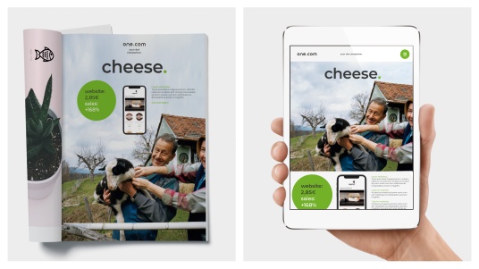 one.com:
one.com is an international, straightforward, and reliable partner to create your own web presence.
So, essentially the epitome of a Dot-Com – we gave the product's benefits, the company's mission, and the communication framework a logical name: "your dot companion." And the dot now ties the name, tagline, and of course, the visual DNA together perfectly.
(for more see our one.com case study)
_resized.jpg) Nodyssee:
Nodyssee:The social aid fund Nodyssee fights illness and poverty and the indifferent attitude of our society towards socially disadvantaged. Crossing out does not remove social injustices, of course, but it makes them visual and raises awareness.
(for more see Nodyssee case study)
 bloom:
bloom, the unique small laboratory for home use, wanted to draw attention with a memorable explanation. With the invitation 'Listen to your Bodytalk' we introduced the method and the consumer benefit to various user groups: from super-fit professional athletes to seriously ill patients. Thanks to bloom all of them can appreciate a better understanding of their own bodies. Body and mind could also be reconciled optically by the two characteristic O's.
(for more see our bloom case study)
_resized.jpg) Management Club Austria:
Management Club Austria:The Management Club connects Austria’s top leaders – linking business with politics or research with industry. We sought a distinct symbol that could unify this mission as both a logo and a key visual, creating a consistent brand identity. The well-known share symbol now gets undivided attention.
(for more see our case+study)
_resized.jpg) Otto-Wagner-Areal:
Otto-Wagner-Areal:When one of the most important Art Nouveau (Jugendstil) projects is carefully renovated, adapted, and opened to the public, it's important to respect and preserve Otto Wagner's legacy. At the same time, we need to show that the concepts of "youth" and "style" have been a part of Jugendstil for over 100 years. Well-known Art Deco elements become even more impressive when they interact with modern styles.
(for more see our case study Otto Wagner Areal )
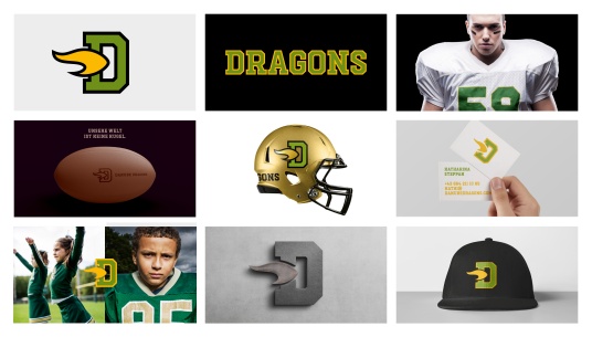 Danube Dragons:
A brand ready to make a visual touchdown in sports history.
Austria’s football champion is scoring a branding touchdown in just three moves. We’re stepping boldly onto the playing field of the most renowned NFL teams, bringing dynamic football action to life while provoking the mythical dragon to breathe fire like never before. This builds confidence across all brand touch(down)points.
(for more see Danube Dragons case study)
 BauConsult:
Bauconsult’s mission: Creating value together.
Team spirit is more than a concept here; it’s lived daily—with clients, partners, and employees alike. Our redesign transforms the existing logo’s bars into storytellers of this brand philosophy. They form a strong, cooperative team, illustrating how value can grow and flourish.
(for more see BauConsult case study)
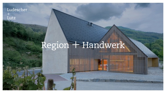 L+L Architects:
Especially in architecture, the often-quoted saying "The whole is greater than the sum of its parts" holds true. Ludescher+Lutz always seek to combine a variety of parameters. From the combination of regional products+techniques, one can just as easily derive an authentic+sustainable result as the building+culture of Ludescher+Lutz.
(for more see our case study)
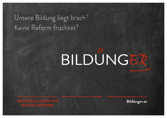 Bildünger:
Education is the basis of a functioning society. The Austrian school system has been lying fallow for decades. New ideas and concepts are the fields that the Bildünger initiative ploughs, cultivates and tills. Name and design convey school at first glance. They do so with a wink and always reap a smile from teachers and learners.