Zündel develops and cultivates brands.
competenceportfoliotechnologymediatourismculture about ZuendelThe essence of a successful brand is always 'selfcontained'. All you have to do is to free it from
True quality-products and their 'good old times' have always been the strongest selling proposition and the most lasting customer-relations-program, by far. The nostalgic memory has to be updated and presented to the new target groups on eye-level, of course. A skilful reduction till the brand essence becomes visible again is crucial at this point. It is also important to resist the temptation of adding modern elements that always produce a close expiration date.
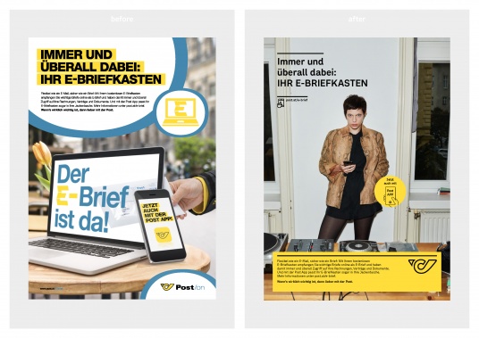
Every move to a new location entails the chance to discard long-hoarded ballast. The exciting mix of optimism and catharsis is an absolute stroke of luck, especially for large corporations like the Post. The new headquarters, looking just as impressive as they are future-oriented, already indicate how the dynamic changes in products, services and customer needs - and also the growing competition - will be met: with a lot of self-confidence, acquired throughout centuries
of experience, and with the courage of the market leader.
Precisely these virtues supplied the parameters for a sharper brand identity, which we pursued with the greatest respect for the traditional optical Post DNA. After all, postillions have been wearing yellow uniforms with black lapels and a striking post horn ever since the Holy Roman Empire under Emperor Maximilian I (1459-1519). No other brand is able to present its own and internationally unique colour, as the Post can. The Post Yellow is now able to shine even more consistently and well suited for a basic provider. The font 'Post Sans', exclusively developed, quotes the dynamics of the post horn and combines high-tech with a sympathetic human touch. The entirely refurbished corporate design translates the brand heritage of the 15th century into the vision of a superior international technology
leader.
(for more see Post case study)
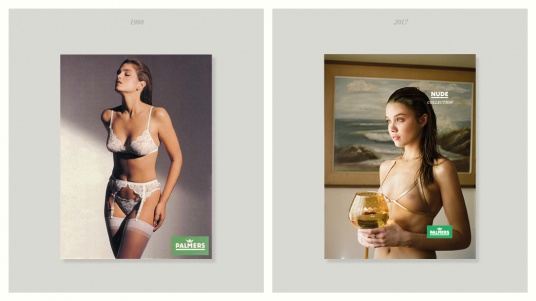
 Palmers - Lingerie since 1914
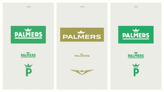
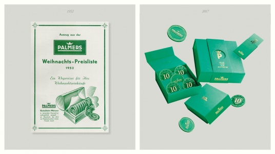
A major key to the tremendous success of Palmers was the high quality it delivered in every field. Excellent product design and manufacturing made Palmers the market leader; expert purchase advice in all Palmers branches did set standards.
By the end of the 20th century the Palmers family retired, the market got tougher and the company proceeded without clear guidelines. This uncertainty was even raised by a drastic change of the corporate design in 2005.
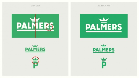
In 2016 the three brothers Wieser took over. They turned Palmers into a family business again and proclaimed 'quality' as top priority. This 'recollection' was our stimulus to reanimate the 'traditional' look and to adapt it for the times to come. After ten years we reactivated the original, formative Palmers Green, polished the Gold, optimized the legendary, one century old logo and fuelled all elements with the self-confidence of a cult brand.
(for more see Palmers case study)
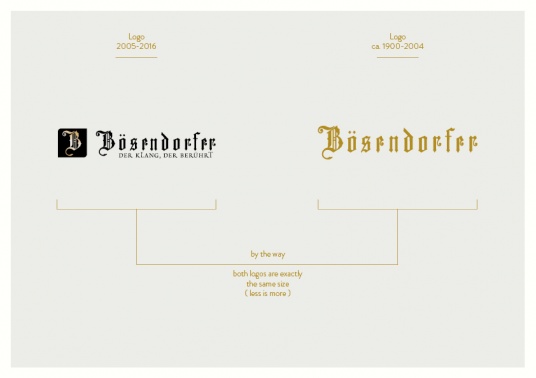
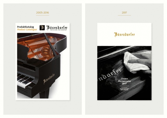
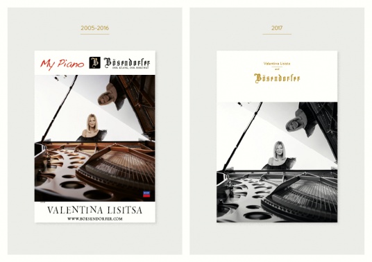
Bösendorfer - Grand Piano Art since 1828
After almost 200 years of experience Bösendorfer had the ambition to re-invent their Grand Piano. Aside from the three legs every single component was changed. The most important ingredient, the Bösendorfer soul of sound, gained even more charisma due to its technical perfection and artistic uniqueness.
We chose the same path for our Bösendorfer brand mission. The (r)evolution of product-quality was made perceptible and comprehensible by the (p)redesign of the brand. However, the new visual concept was not based on innovation, as the acoustics were, but on recollection.
In 2005 Bösendorfer started a first attempt to modernise its lettering. A visual quote from the digital world was forced into it, the use of the then modern 'application-look' seemed handy. Yet as a 'formal' statement it seemed contradictory to the analogue sound quality, the craftsmanship and to the art of Viennese piano manufacturing. The Bösendorfer brand essence was missed by far, the lettering soon 'downed' in the digital every-day current.
We 'liberated' the delicate and very complex lettering, added a plain style and typography and created a more generous active space. Now the brand visually conveys the unique sound of a true Bösendorfer Grand Piano again.
(for more see Bösendorferl case study)
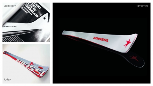
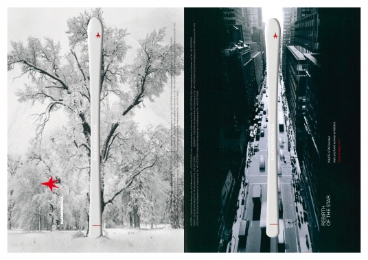
Kneissl Pioneer-Spirit since 1862
Karl Schranz, Toni Sailer, Franz Klammer and Bernhard Russi are the ski-heroes of many generations, they made the Kneissl star shine. The source of this glamour lies in the unique Kneissl brand values: pioneer-spirit, curiosity and joyful experimentation. Skis in general and worldwide are technology carriers of ground breaking Kneissl inventions. Kneissl layer structure and carving shape, for example, turn modern skis into the agile and controllable sports-gear we enjoy today.
Our task: Kneissl wanted to appear proud, individual and courageous just like in the times past. The new design of the ski collection is the apparent proof: Self-confident reduction is a much clearer positioning than the modernistic and interchangeable opulence many competing brands employ.
(for more see Kneissl case study)
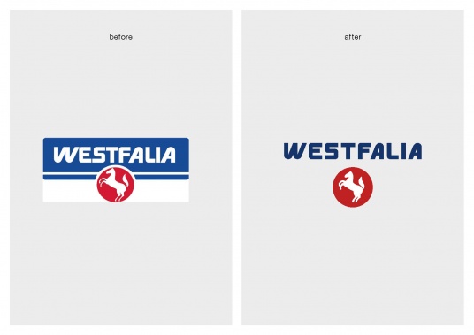
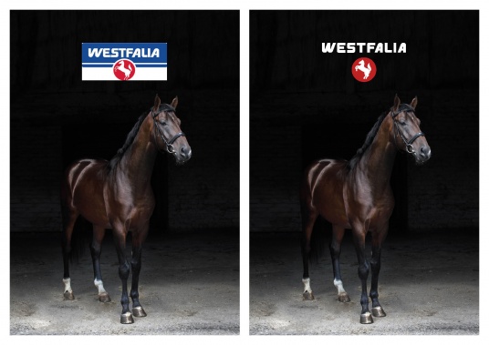
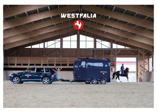
Westfalia - For the Love of Horses since 1844
Westfalias tradition extends back 175 years during which the company has become synonymous with the superior transportation of people and horses. In 2015, the Austrian family Gottschalk took over the company together with veterinarians, designers and engineers, developed innovations which are dedicated to the health in horses as well as driving comfort, safety and elegance. Westfalia is leading the way to a successful future in a safe and elegant way
with tradition and outstanding technology.
And that is exactly the stoty, the cautious redesign intends to tell.
www.westfalia-trailer.at