Zündel develops and cultivates brands.
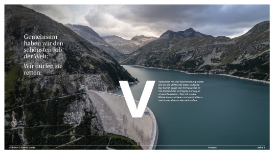
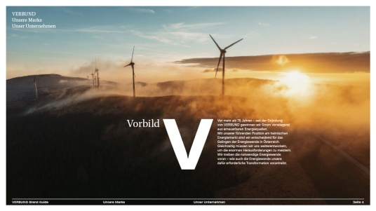
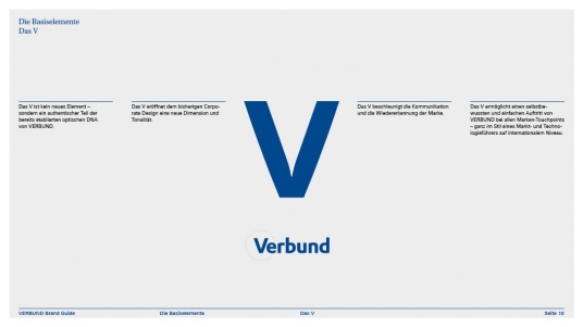
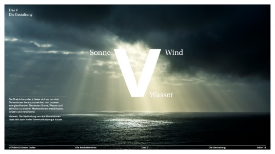
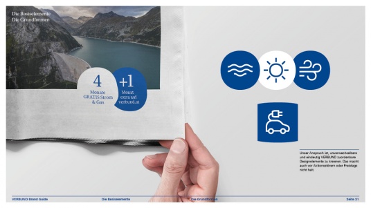
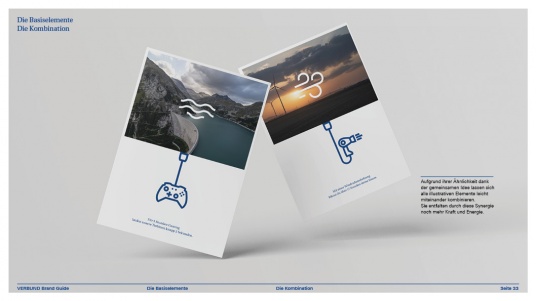
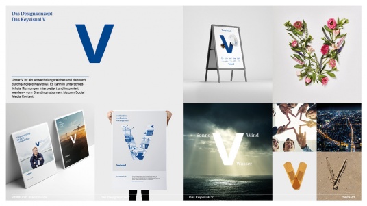
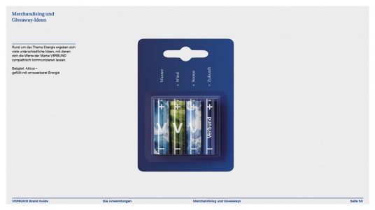
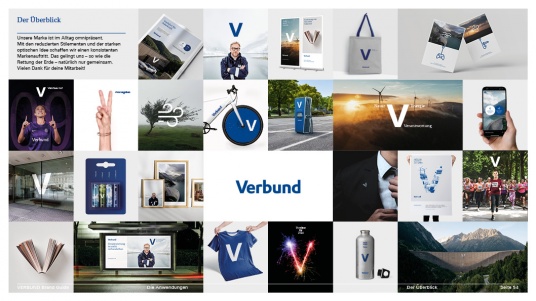
competenceportfoliotechnologymediatourismculture about ZuendelThe appearance of the Verbund brand was very discreet, very consistent, very correct for decades. The issue of climate change has grown extremely over the years - hence the responsibility of Verbund - and thus the need for a contemporary, multifaceted, more diverse brand tone. The fight against climate change must be conducted quickly and energetically - with Verbund at the forefront. This mission must educate without wagging a finger and without being preachy - effective solutions and products, on the other hand, may be confidently and loudly promoted. This demanding balancing act between different tones calls for a simple visual clamp. With a simple V, we demonstrate that Verbund wants and will make a strong statement - taking responsibility and assuming a pioneering role. The V idea is not a new element - rather it is present in the visual DNA and in the established logo and can even be anchored in the brand strategy. This is how Verbund wants to lead, change, and connect in the future. This trinity is constantly encountered within the brand - so the V can not only visually connect or unite the energy sources water, sun, and wind but also the new brand values of responsibility, pioneering role, and change (in German these are called Verantwortung, Vorreiterrolle and Veränderung). Hidden in the V is a verbal and visual communication clamp that can easily unify all brand touchpoints - from business cards to billboards. The V connects public space with classic communication - subtle educational work with loud ideas against climate change and energy crisis. The V does not become a new logo - the combination of the Verbund logo and V visual, together with the associated communication clamp, generates enormous energy, accelerates recognition, and simplifies the entire brand appearance. As part of the visual and content restructuring, even the 'Mission 2030' received a new name - the 'Mission V' will profoundly shape the Verbund brand - outwardly but especially inwardly for the 3,200 Verbund employees. And the V transforms the quite reserved corporate brand Verbund into a friendly, adaptable LoVe brand.
Zündel was allowed to give the Verbund-V the appropriate responsibility and prepare the entire corporate design for the so different tones. A real privilege to be involved in the Mission V.
Here you will learn more about the Mission-V
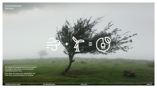
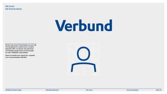
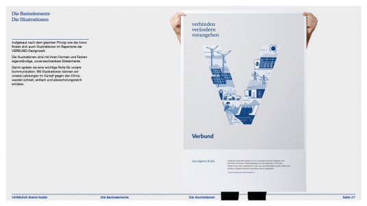
We were pleased to create icons and illustrations with www.rosebud.cc_small.jpg)
