Zündel develops and cultivates brands.
competenceportfoliotechnologymediatourismculture about ZuendelAn M is an M.
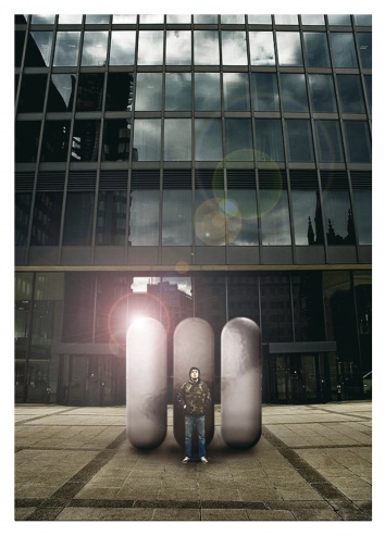
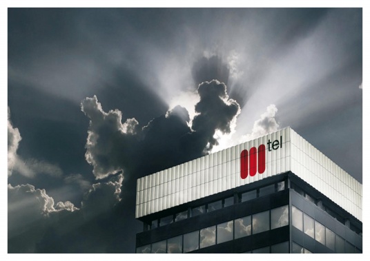
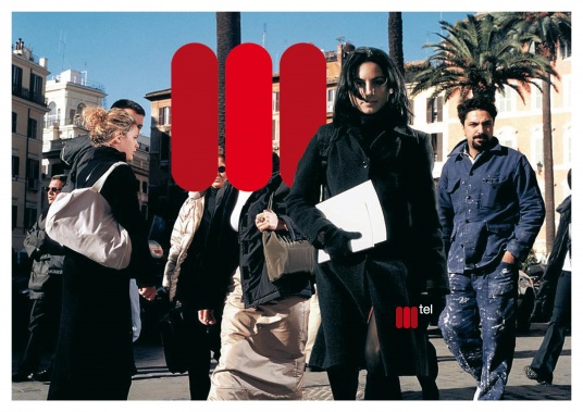
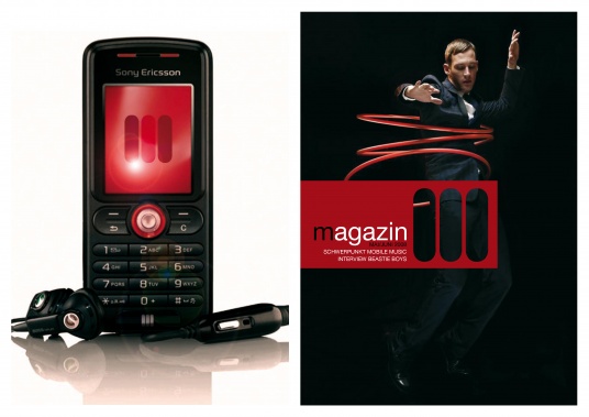
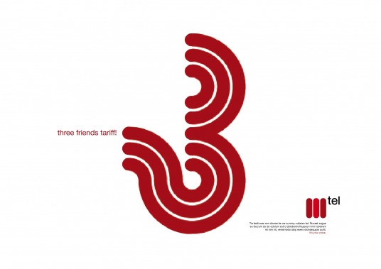
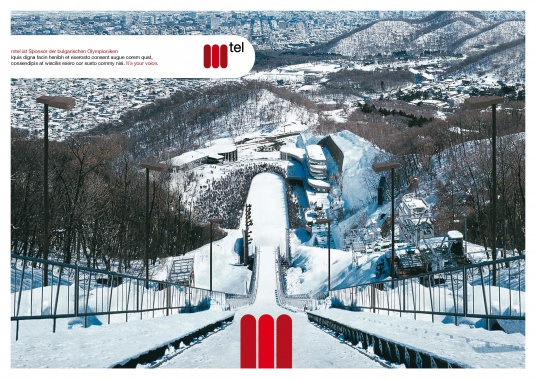
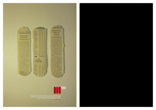
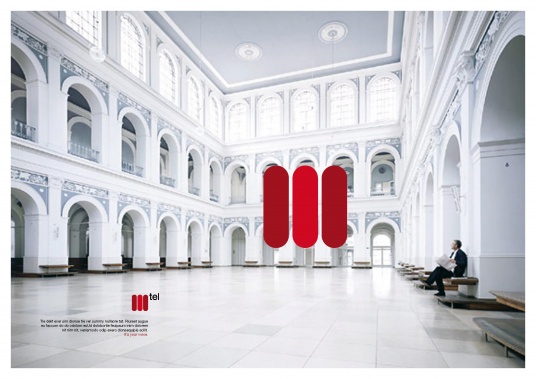
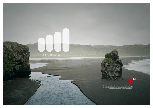
An uncompromising reduction down to the very essentials is only possible when the brand is guaranteed to develop exceptional charisma. In Bulgaria you come face to face with the largest telecoms provider at every turn, every day and in every medium. So, the three lines would be perceived as an M from the first sighting and would be memorised at once, becoming unmistakeable despite the simplicity. Mtel connects people - the logo communicates this as strongly as it projects the self-confidence of a market leader. The clarity of the logo opens up unlimited possibilities for communication, something that Mtel itself appreciated. However, the shareholders opted for a more cautious approach and we were "only" allowed to refresh the logo (see Mtel smooth redesign).
We developed this brand for the executive advertising agency Demner Merlicek und Bergmann - but the time simply wasn't right.
www.dmb.at