Zündel develops and cultivates brands.
competenceportfoliotechnologymediatourismculture about Zuendelwîse up
The briefing from the Austrian Economic Chambers was clear, simple, and very ambitious.
We are looking for a brand for the Netflix of education.
The digital education platform offers access to professionally curated educational content with over 15,000 courses – all simple, effective, and attractive.
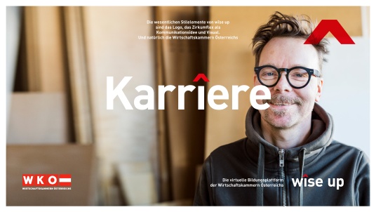
The brand's vision is a world where people and companies can reach their full potential.
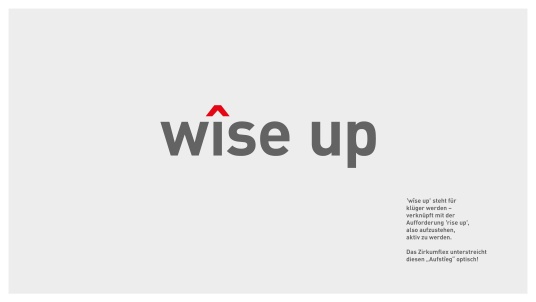
wîse up stands for getting smarter – combined with the call to rise up – to stand up, take action, grow, and flourish.
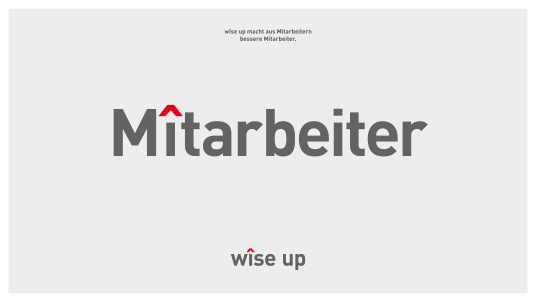
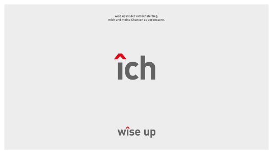
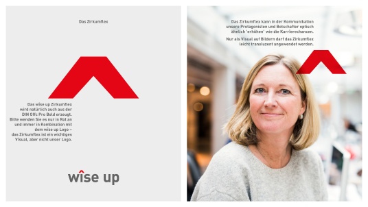
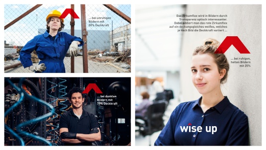
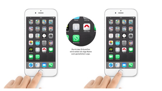
The circumflex visually emphasizes this "rise" and, for example, turns companies into better companîes. wîse up is also the simplest way to improve oneself and one's opportunities. wîse up makes career advancement easier and faster – not just visually making mîssions more successful.
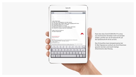
wîse up is name, claim, brand value, and attitude all in one. The circumflex becomes a strong visual trademark, a consistent visual bracket, and a flexible communication idea. The circumflex can, for example, be easily used as a character in email signatures, making tedious attachments unnecessary and even "promoting" an app name into a designed logo.
We had the prîvilege of developing the name, logo, and communication bracket for St. Stephens.
See also: naming
See also: talking design
www.wise-up.at
www.saintstephens.at
_small.jpg)