Zündel develops and cultivates brands.
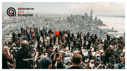
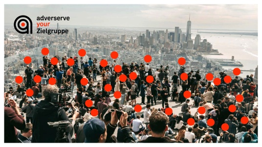
competenceportfoliotechnologymediatourismculture about ZuendelTarget the Target’s Target.
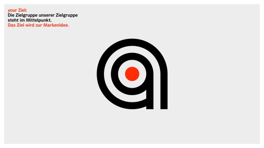
As often happens, it’s surprising how straightforward branding becomes—once you’ve nailed the core idea.
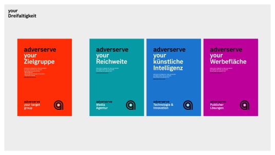
adverserve covers three completely different focus areas, each with its own independent unit—meaning very different audiences. But these audiences become the shared mission.
Because media, ad tech and publishing—adverserve’s triple threat—all aim for one thing: reaching the target of your target.
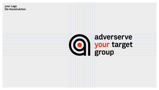
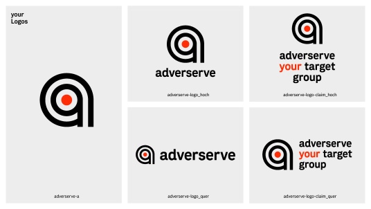
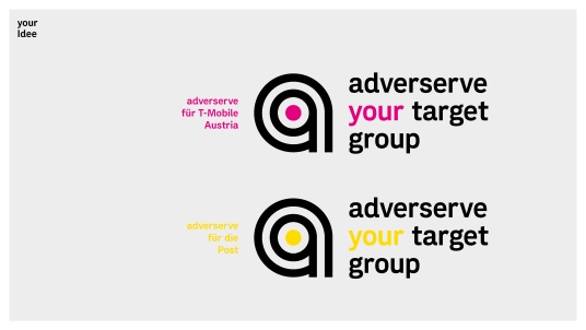
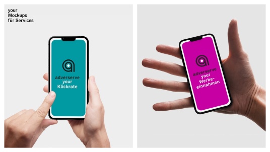
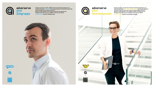
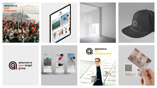
To prove adverserve isn’t your run-of-the-mill media agency, we turned the name itself into a stance.
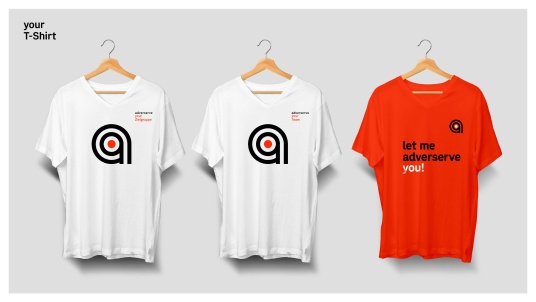
It’s now a verb, an attitude, a promise. From “adverserve your audience” to “adverserve your click rate”, messaging becomes sharp and focused.
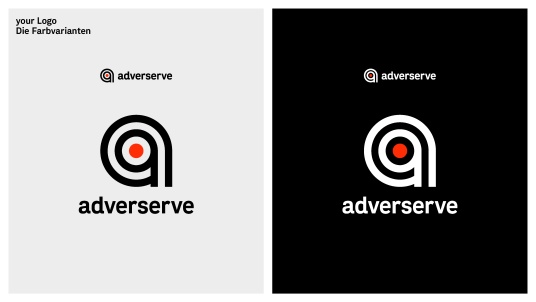
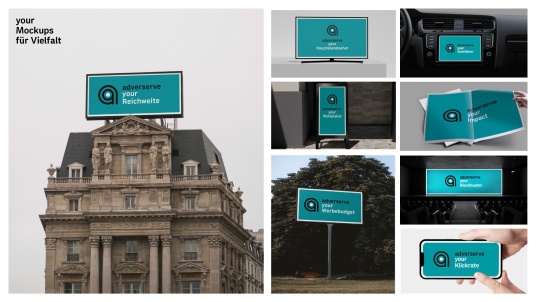
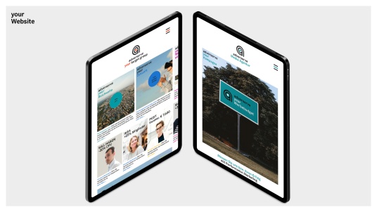
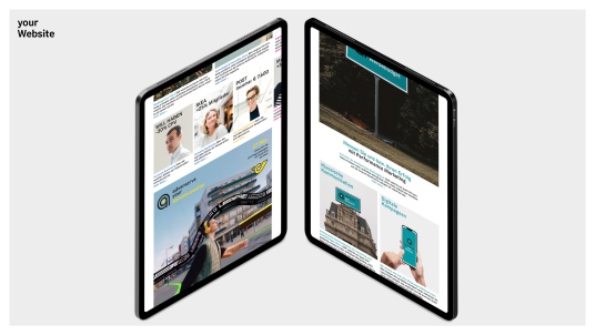
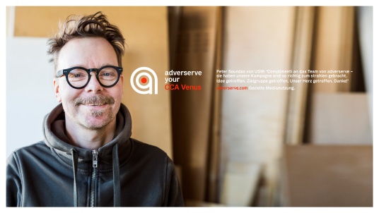
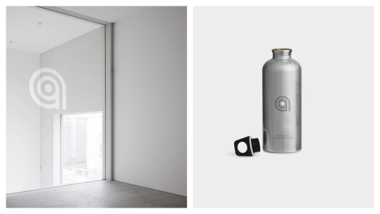
And to show we’re truly aiming at your clients’ targets, the design absorbs their corporate colours.
“Let me adverserve die Post” goes yellow, and “Let me adverserve Magenta”—well, of course—Magenta.
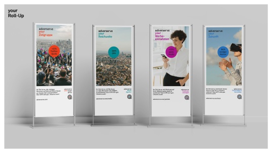
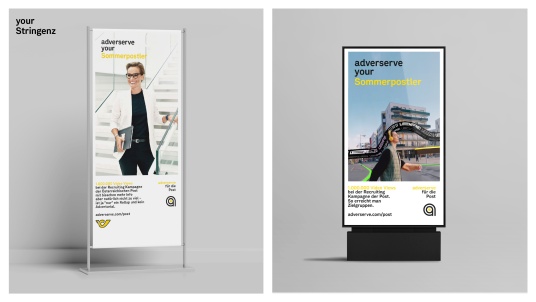
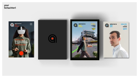
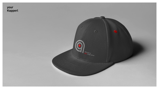
This simple idea scales beautifully: the campaign materials almost design themselves.
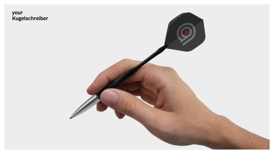
A dull old pen becomes a dart, aimed right at your audience.
We had the chance to give adverserve a complete rebranding just in time for their 25th birthday—strategy, claim, logo, the lot.
Everything changed—except the name. And even that got a whole new meaning.
See also: talking design
www.adverserve.com